My Role
Lead UX/Product Designer – responsible for UX/UI, visual design, user research
Team of Collaborators
Front End Engineer
Technical Program Manager
E-commerce Lead from Concepts
Concepts core team
Accessibility Designer
Project Date
Feb 2021 – Aug 2021
Cncpts.com Background
Concepts (cncpts.com) was one of the first luxury streetwear shops to curate high-end clothing and covetable streetwear together for the lifestyle consumer. From their retail success, they’ve partnered with Zappos to continue solidifying their reputation and improve their e-commerce platform.
The Problem
Initially, I was brought onto the Concepts e-commerce Shopify platform to revamp certain areas of the site by providing quick UX fixes and improvements. Their platform lacked consistency and cohesiveness, not representing an elevated, luxury experience. However, I quickly realized these small fixes would lead to inconsistent design decisions and affect business goals, not to mention inefficient time spent for both design and development. As the sole designer on the project, I advocated to establish a design system foundation that would fit Concept’s business goals and improve the overall user experience. Thus, a complete site redesign was kicked off!
Defining the Goals
Business Goals: The overall goal of the site redesign focused on improving the customer journey, maintaining consistent branding, and increasing conversion and site engagement.
Internal Goals: The internal goal focused on establishing a robust design system that provided consistent guidance on design elements and improved workflows for designers, engineers, and content teams.
How are we measuring success? We’ll be tracking e-commerce revenue based on 2019 and 2021 (business stakeholders will not consider Covid sales into the equation). Experience wise, users and stakeholders will feel the same luxury, exclusive feeling as if they were currently in a physical Concepts store.
Research
Site Audit
In the beginning of the project, I held a discovery session with Concepts stakeholders in order to understand the site’s strengths and pain points. Patterns began to emerge regarding branding, UX, and technical constraints by Shopify.

User Demographics
To create personas backed by data, the Concepts stakeholder and my team referenced Google Analytics statistics. The following details accurately represents who the main users are and how they access the site:
- Age: 18-34
- Male: 80%
- Female: 20%
- 85% mobile traffic
- Depending on special product drops, a large amount of traffic stems from bots.
- Hype beasts, streetwear focused consumers with disposable incomes
Competitive Analysis
After stakeholder interviews, I learned Concepts’ main competitors are Kith, Bodega, and Union, which all carry renown brands and luxury streetwear dedicated to hypebeasts and collectors. By analyzing their websites for both Desktop and Mobile, I discovered many opportunities for Concepts in order to stand out among its competitors. Opportunities included:
- Clear and cohesive header -> improve information architecture by incorporating a robust megamenu with more links for visibility
- Consistent home page components and product cards
- Follow a standard image and asset size for components
- Accessible text on top of image (both Concepts and competitors failed contrast ratio tests)
- Improved grid, typography, spacing and overall branding to accurately represent an exclusive, luxury experience

Information Architecture
After rounds of research and stakeholder interviews, the team and I were ready to tackle restructuring the information architecture by re-prioritizing pages and adding a megamenu feature for Mens, Womens, and Brands to improve the customer journey. This also helped increase visibility on what Concepts offers and drive sales to certain exclusive products. News/Drawings were separated out into Releases and Blog to segment out product drops/drawings & news and align with the business to drive customers in the right direction during special drawings.

Establishing the Design System
To create a solid foundation for the new Concepts’ design system, I leveraged an internal design system that shared a similar structure from other Zappos vertical streetwear sites and reworked elements to fit Concepts’ branding and requirements. Considering how the user base is significantly mobile, the goal was to ensure all designs were mobile first. Only Desktop and Mobile viewports are displayed below, but Tablet viewport is included in the design system.
Following stakeholder prioritization, development first started on Header & Footer. From there, Home Page components were built and led to focus on the Product Detail Page. The Product Listing Page is currently in the dev pipeline.
Foundation
The grids, typography, interface elements (button and link interactions, etc), and spacing were outlined in order to provide a base foundation for the design and dev work ahead.
Redesigned Components & Layouts
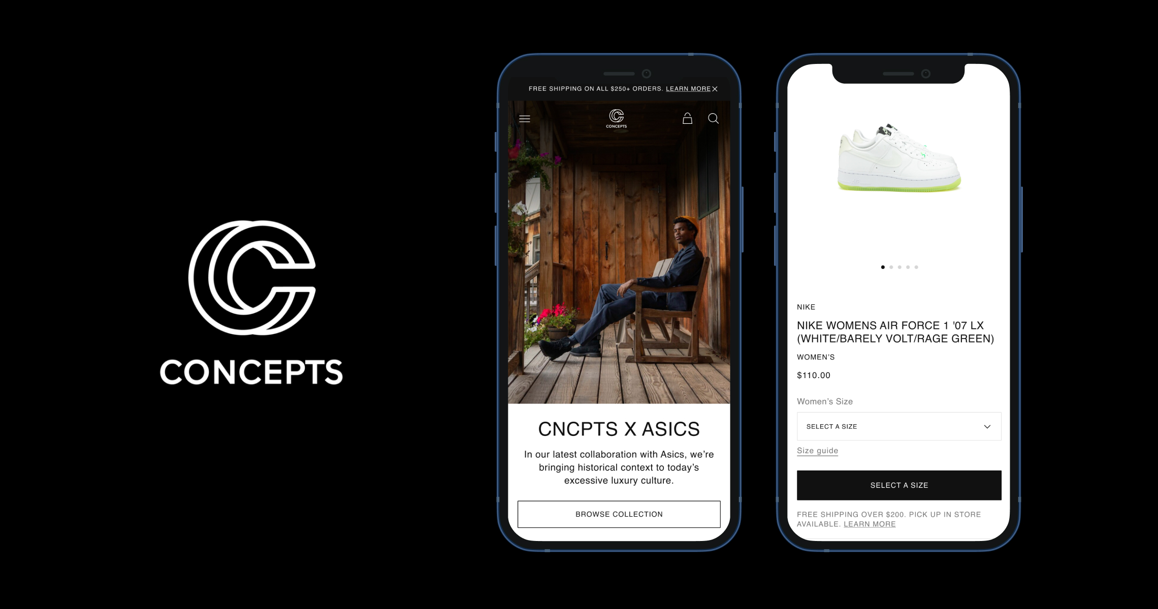
With the information architecture changes and addition of the megamenu dropdown, the new Header provided customers a better understanding of what products Concepts offered, while showcasing an elevated experience of clean, minimal design with strong imagery.
The new footer was cleaned up to match the elevated experience and follow the new design system’s grid and spacing.


I worked closely with Concepts stakeholders and the front-end developer to design Home page components that were consistent, on brand, and allowed for compelling storytelling via strong imagery and supporting text. With a large emphasis on accessibility, I ensured that each component passed contrast ratio tests regardless of any image used by placing a 50% opacity overlay. In this particular mockup, an accessible transparent menu was designed as well to further elevate the modern brand experience.


Next, we focused on redesigning the PDP by making the image gallery selection more accessible, fixing spacing and typography issues, and switching to labeled form fields that met best UX practices. The old design’s size dropdown was inaccessible and difficult to select options.
Shopify Technical Limitations:
- Inability to shorten product titles due to the process of uploading each product with its brand name and colorway.
- Complexity around Desktop airplane seating and how it impacts gender sizing (currently there are no labels to indicate what shoe size you are purchasing if unisex)
3. PDP image upload cannot distinguish between editorial images and product images, so PDP is unable to expand beyond image carousel.


The redesign on these pages focused on expanding filter functionality, improving shopping experience by elevating product card design and typography, and incorporating e-commerce search page best practices (from visible search count to clear page title, to functional filtering, easy to click on pagination, etc). Currently this redesign is not live yet.


Pending Redesign
Login, Checkout and My Account are in the current pipeline for redesign.
Redesign Outcomes
Business Impact
Since the redesign kicked off in Feb 2021, progress on the e-commerce site has drastically improved the customer journey and elevated the Concepts brand experience. As for the business impact, we saw the following metrics:
- Returning customers engaging with site were up 40%.
- Comparing 2019 to 2021 (Jan – June 30), online sales increased from $2M to $5.4M.
- In Q2 2021, $2.7M e-commerce revenue out of $6.7M total from retail sales.
- Conversion rate is highly dependable on exclusive drops and high energy raffles:
- For every 400,000 users attempting to get 100 pairs of limited Jordans, 399,900 users can’t convert and will tank the conversion rate.
Internal Impact
The creation of a robust design system has streamlined development work significantly and established a consistent and cohesive guideline for content managers and photography/editorial. With a large emphasis on accessibility, the redesign is inclusive for all users and works well via screen-readers.