My Role
Lead UX/Product Designer – responsible for UX/UI, visual design, user research, user testing
Team of Collaborators
Full Stack Engineers
TSR core team (editorial & merchandise)
Accessibility Designer
Head of Research
Project Date
Sept 2019 – Aug 2021
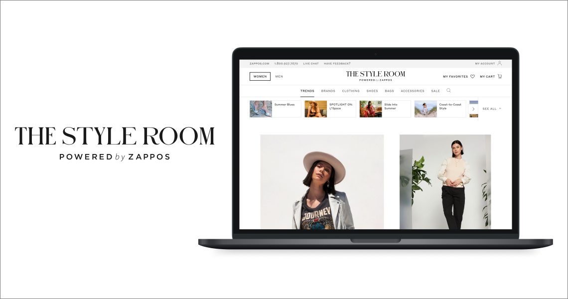
The Style Room Background
The Style Room is a Zappos vertical site that initially soft launched in Oct 2019. The platform is dedicated to creating a unique, curatorial shopping experience that provides inspiration and education to build style confidence in our users. As fashion e-commerce continues to grow, intent-driven searching isn’t the only way to engage now! The Style Room (TSR) team carefully crafts strong storytelling and leverages product versatility to become a fashion hot spot.
Defining the Business Goals
The overall business goal was to ensure the site consistently emphasized its fashion focus principles and increased purchases and loyalty with existing Zappos customers, as well as incentivizing top tier fashion brands to partner with Zappos.
The emphasis on niche trend storytelling and focus on emotion over transaction has led to more engagement and increase in revenue significantly.
Given that Covid has made a tremendous impact on the world and proven the need for e-commerce driven platforms, the business side of editorial production was streamlined to create 18 editorial stories per month.
Understanding Our Users
User Feedback – Implementing Voice of Customer (VoC)
To engage and empathize with our users on pain points, frictions, and general feedback, the Zappos UX Research team and I set up custom Voice of Customer (VoC) survey links dedicated to the TSR experience only. When responses are recorded, they are analyzed via Chattermill and produce sentiment based analytics, allowing my team and the TSR team to track qualitative data aside from quantitative data via user testing. The links were placed in two areas, above the header with Zappos links and embedded within search results:

User Testing
With every new feature and improvement to the user experience, I strive to listen, observe, and understand what users are saying and doing. Majority of user testing has been done on usertesting.com. Below is a selected user test that provided significant insight into a new feature:
Goal: Determine which color swatch option design users preferred, either colored circles or product images, focusing on usability and visual appeal.
Scenario: Imagine you are shopping for women’s shoes on a luxury fashion website.
Number of participants: 10
Average time spent: 4-15 min
Demographics:
Age: 25-50 yrs old
Household income: $80k-$150k+
Country: USA
Technical Constraints: Multi-colored products can only display Rainbow pattern swatches. Current taxonomy rules do not contain specific types of swatches.
Tasks: Users were asked to compare the mockups below and identify what colors were offered for two pairs of particular shoes, the “Hey by Bagdley Mischka” and “Miya by Dolce Vita.” After completing the tasks, users were asked the following:
- Which version was easiest to understand what colors were available for the products?
- Design wise, which version looked cleaner and easy to read?
- Overall, which version did you prefer in your shopping experience?
Version A

Version B

Key Takeaways:
- For the multi colored shoe Miya by Dolce Vita, majority of users didn’t understand what the rainbow swatch meant and found it confusing.
- In the balanced comparison, for the users who saw Version B first, they immediately understood what the rainbow swatches meant when looking at Version A after. However, for those who saw Version A first, they were unsure what the rainbow swatch meant.
- 7/10 users preferred the product image swatches (Version B) because:
- Product image displayed a more accurate representation of the color options available
- Being able to quickly glance at the product image led to efficiency and no guesses on what the color displayed could mean (i.e. does the pink mean the whole shoe is pink? only part of the strap? heel? etc)
- 3/10 users preferred color swatches (Version A) because:
- All users felt Version A was cleaner and easier to read. However, they did mention both designs were relatively clear.
Outcome: Version A was implemented.
New Features
Filter System Redesign
The Problem
Since implementation of VoC, we’ve uncovered some important insights from our users: Filters on Search Results pages were difficult for users to find and use, as its placement and lack of prominence were easy to miss. To address this issue as a quick fix, the Refine and Sort by button outline stroke was thickened. However, the larger problem still existed. Besides placement, users had very specific issues regarding size selection.
The Solution
From its original design, the filters were not expandable to meet more robust and complex facet selections. The limited amount of space was a large issue. Thus, an expandable filter system was redesigned and implemented to address those customer pain points and provide many more filter categories to select from. Especially for a fashion-forward site, customers gave very specific feedback such as showing heel height and pattern selections.


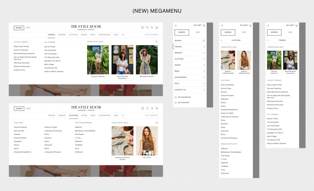
Megamenu
The Problem
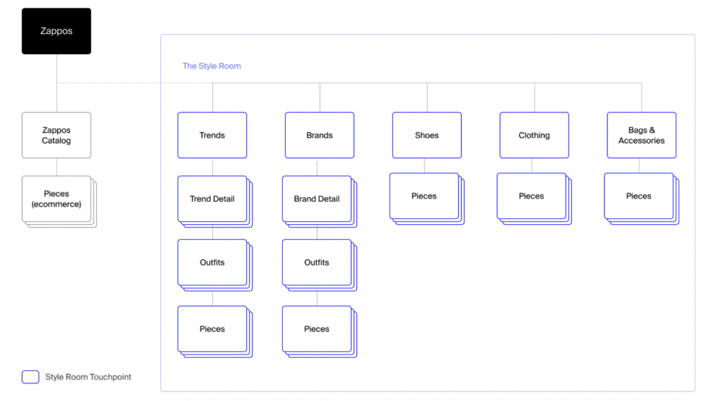
The Style Room header contains direct links to trend pages, brand pages, and product categories. However, the experience is limited when it comes to interacting with deeper level product categories, forcing the user to take multiple steps in engaging with a specific product in mind. The new information architecture must address these pain points and align consistently across all viewports. Below is the current sitemap:
Challenges
One of the challenges I faced was ensuring we incorporated the essential trends subnav beneath the navigation. Initially that was planned to be removed from the top level and added within the megamenu. However, this would’ve impacted revenue and engagement with these stories hidden. For example, in the month of March 2021, the top 5 stories from the subnav bar totaled $195k in revenue.
We also faced the potential lack of consistency between Mobile/Tablet and Desktop, thus pushing for a mobile first approach. To see All Brands or All Trends, the links open in a quickview instead of a direct page, so I discussed with stakeholders on how we wanted to approach linking and displaying these elements.
Solution
- Keep the subnav menu as is on Trends and Brands pages. This allows the trends to stay visible and maintain engagement, especially on Mobile and Tablet.
- Each menu link drops down to a megamenu with appropriate links and editorial imagery. The megamenu helps highlight everything TSR has to offer without affecting the subnav menu. Each dropdown will follow a consistent column width. On mobile, a multi page navigation is designed to correctly structure each of the sections within the menu. To promote storytelling and engagement, the editorial component is pushed up above the nav links.
- With direct links to Trends and Brands pages, users will be able to access archived trends and see all brands within the megamenu. The link to quickview on its pages has been removed and replaced with direct links to maintain consistency.
New megamenu is pending development.
Additional features and user flows I’ve designed:
- Placement of Goods for Good icons in PDPs
- Don’t See Your Size & Notify Me in PDPs
- Out of Stock flows
- 404 Error Page
Business Outcomes
Since the Home Page is focused on editorial trends and high-low styling recommendations, AOV (average order value) has steadily increased by 8% from the beginning to end of 2020: $298 to $324. With the introduction of new home page components I’ve designed, we’re looking to constantly improve storytelling and unique curation. Net gross sales $25M in 2020 YTD, about $400k revenue per week.