My Role
Junior UX Designer, UX/UI, visual design, user research, user testing
Team of Collaborators
Method Design Agency
DigiValet Engineering
Encore Boston Harbor stakeholders
Project Date
Jun 2018 – Feb 2019
Background
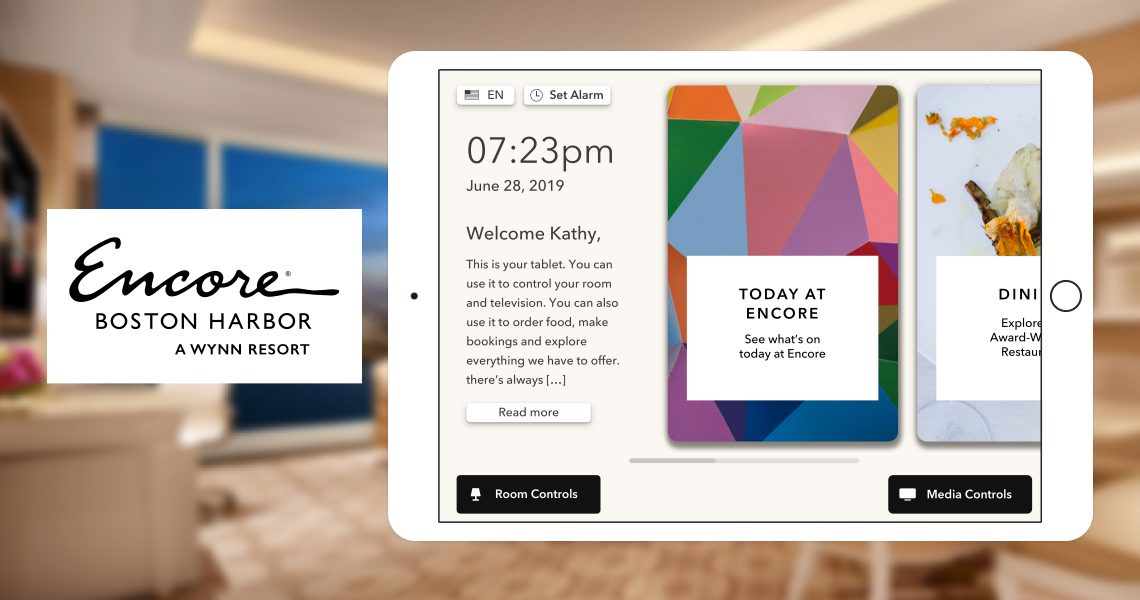
Wynn Las Vegas is implementing an In-room iPad experience in their new property Encore Boston Harbor (opened June 2019). The iPad contains many functionalities and features, including room controls (lights, curtains, temperature, etc), TV/movie control, and information about dining, spa/salon, amenities, etc. The current deployment is Phase 1, an out of the box solution created by an external vendor. Phase 2 will consist of a new redesign led by me and another external vendor. It is being developed now and will be released in December 2019.
This project involved a large number of business stakeholders (EBH executives), engineers, and external vendors working on the design and implementation of the new iPad experience. On the engineering side, we worked with DigiValet, an iPad based guest room solution for luxury hotels. On the design side, we worked with Method, a design agency. In my role, I brought to the table my knowledge of Wynn history and branding to collaborate with the designers to create an experience fit for a 5 star luxury hotel.
The Problem
As this was a completely new initiative for a brand new luxury hotel, we realized that the out-of-the-box solutions DigiValet provided would not work well for Encore Boston Harbor’s specific needs. Thus, Method was brought in to work along with DigiValet engineers to craft a custom experience.
Defining the Goals
The goal of this project was to understand the needs of Encore Boston Harbor guests and create a simple tablet interface that addresses those needs. The task at hand was to improve the UX and UI of the outdated out-of-the-box solution provided, such as decreasing the number of navigation types, updating the bad information architecture and fixing the overcrowding of features on certain screens.
Overall, the app on the tablet needed to be user friendly, intuitive, have fast response time, easy to see and handle with buttons, easy to locate, font large enough to read, and screen navigation kept simple.
In the discovery phase, I interviewed business stakeholders to understand their needs, goals, and why the tablet was being added to the rooms and determine what features were being kept. While also acting as the product owner for this project, I helped gather the business and product requirements.
Research
User Demographics
To give context, Wynn is a luxury Forbes 5 Star hotel focused on giving the best customer experience with great attention to detail. While Encore Boston Harbor is a new property with the same values, we needed to know the new demographics and user base, as they’re slightly different from Wynn:
- 30-60 years old, with the average leaning towards 55 years old.
- Types of customers include regional customers, business guests, convention guests, international travelers, and most importantly casino customers, who are the largest user base. Using this information, we created various customer journeys to follow.
Competitive Analysis
To conduct comparative analysis, I looked at competitors’ in-room tablet experiences such as Aria and Cosmopolitan in order to gauge the different feature sets and UX for their tablets. Aria included incredible amounts of information through numerous navigational tabs, as well as the ability to order room service and book reservations through the tablet. The Cosmpolitan’s tablet experience was more simple and only contained links to their website, with no integrated systems to allow ordering via tablet.
Tablet Location
An interesting note is where these tablets were located inside the guest rooms. Intuitively, the Aria tablet was placed by the bed on the adjacent nightstand. However, Cosmopolitan’s was located right next to the doorway. One question that came up during a stakeholder interview was how does the tablet fit within the room itself? Is it supposed to blend in and act as an integrated part of the room? Was it a random device that stands out awkwardly? In Wynn’s context, the tablet has to be helpful in giving the best customer experience through the hotel.
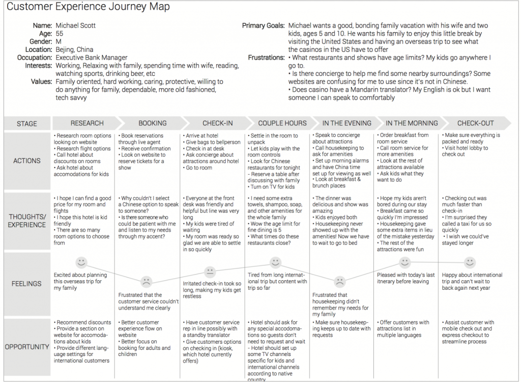
Customer Journey Mapping
Using data provided from interview sessions with stakeholders and hotel guests, I mapped out a sample customer journey for an international hotel guest looking for a comfortable vacation spot with his family.
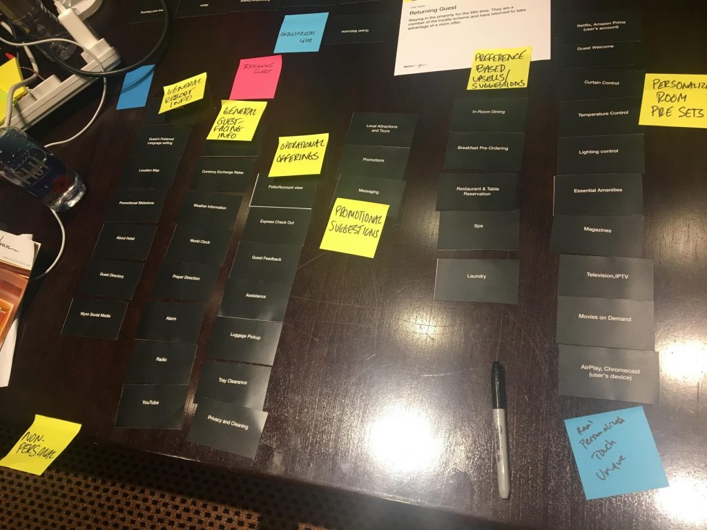
Card Sorting
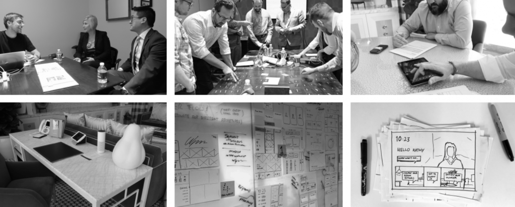
During this research process, a large workshop containing stakeholders, product team and designers were brought together for user testing sessions on the Phase 1 solution to find any pain points and challenges, and a card sorting exercise to prioritize features. To emulate how guests are feeling during their stay, user testing sessions were held inside some of the guest suites at Wynn Las Vegas.
Research Takeaways
- Comparative analysis: Overcrowding of navigation in Aria’s tablet. Too much information given at once, which overwhelms and confuses user. Use of various navigation structures such as horizontal and vertical, which were similar to the navigation issues in Phase 1 solution.
- Prioritizing features: Based on card sorting, user testing sessions, and discussions with stakeholders, we prioritized Room Controls and Media Controls. These needed to be accessible at all time.
- Navigation structure: Implement a simple navigational structure to maintain consistency across all screens.
- Information overload: With the amount of information and functionality included, the goal was to avoid overcrowding the screen and overwhelming the user with all the options.
- Development limitations: Many integrations needed to be built out, from the vendor to utilize our SiteCore CMS APIs to reservation and housekeeping systems. These were defined by both timeline limitations and development resources.
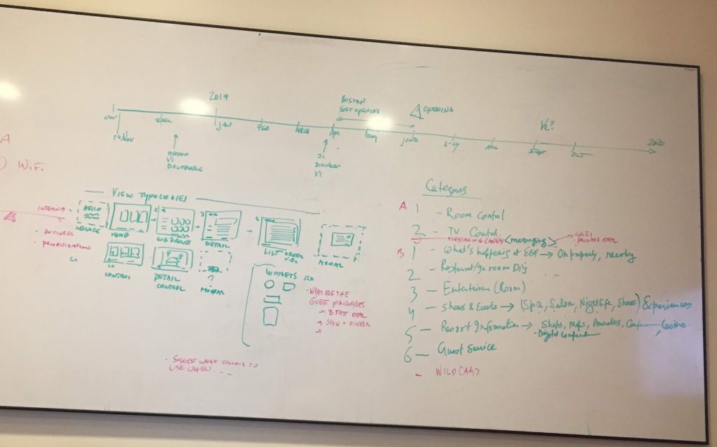
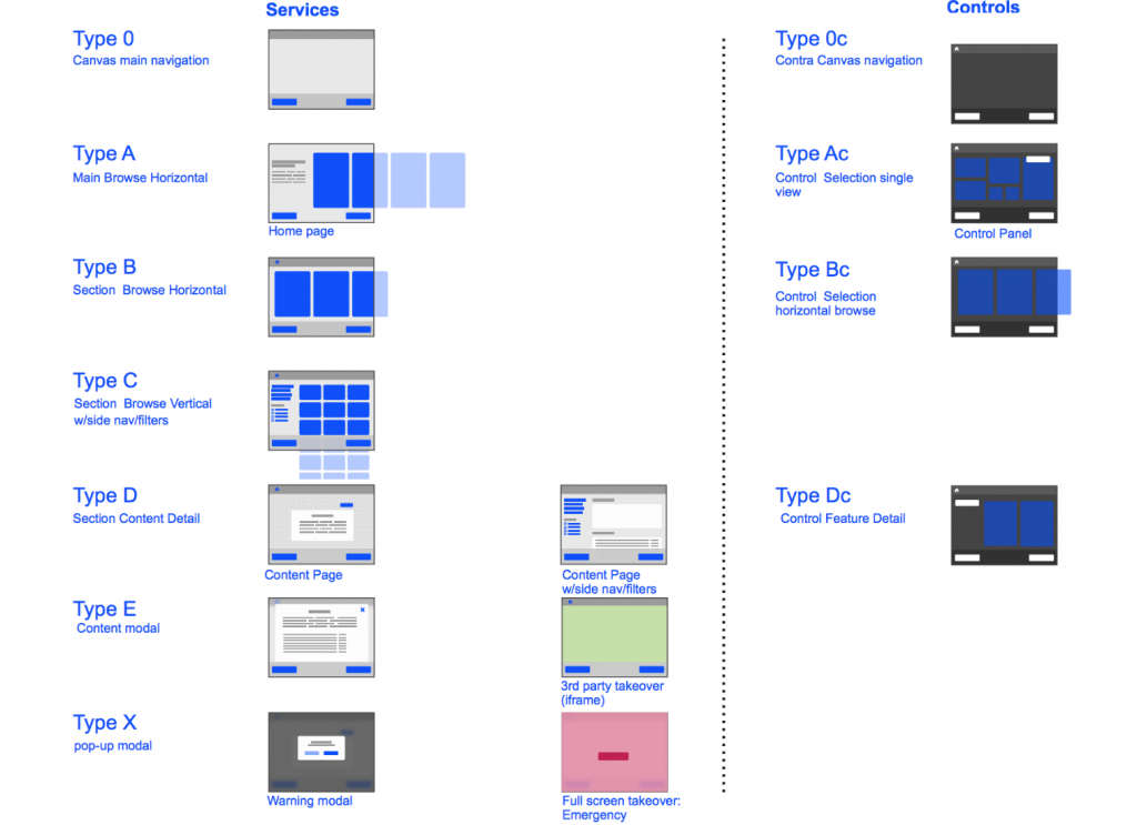
Information Architecture
Once all the information was gathered, we began to focus on mapping out an information architecture to address the requirements and research conducted.
Designs
Using this above, we designed wireframes, mockups and rapid prototypes, which were validated in user testing sessions with real guests. In the design iterations, we addressed different types of navigation structures and placement of main features to improve readability and usability. For room/media controls and overcrowded screens, we enhanced font size and placement of our designs based on our demographics. We also took into consideration the information being pulled from our SiteCore CMS to ensure they were being extracted and displayed correctly. We incorporated all screens with the Wynn branding and visual design.
Samples of Phase 1 solution:
Prototoype of Phase 2 redesign:
Click Here (please contact me for password)